Sailing for a new generation
A six-week UX research and experimentation project for Svenska Kryssarklubben, investigating why 20–30 year-olds with sailing interest don't convert on sxk.se.
UX Design
Overview
Over six weeks I worked in a team of six persons on a UX research and experimentation project for Svenska Kryssarklubben (SXK), a 100-year-old recreational boating organization facing a sharp generational gap in their membership. The brief asked us not to design a finished product, but to run evidence-based experiments and translate what we learned into grounded design recommendations.
My Role and Contribution
I contributed across all phases of the project rather than owning a single lane. In the research phase I planned and conducted user interviews, focusing on understanding how people aged 20–30 first encounter SXK online and where that initial interest stalls. Later, as we moved into ideation and prototyping, I took on a larger design role. I finalized the low-fidelity wireframes in Figma, which we used for testing our hypotheses. I then built the high-fidelity prototype based on our findings.
The Challenge
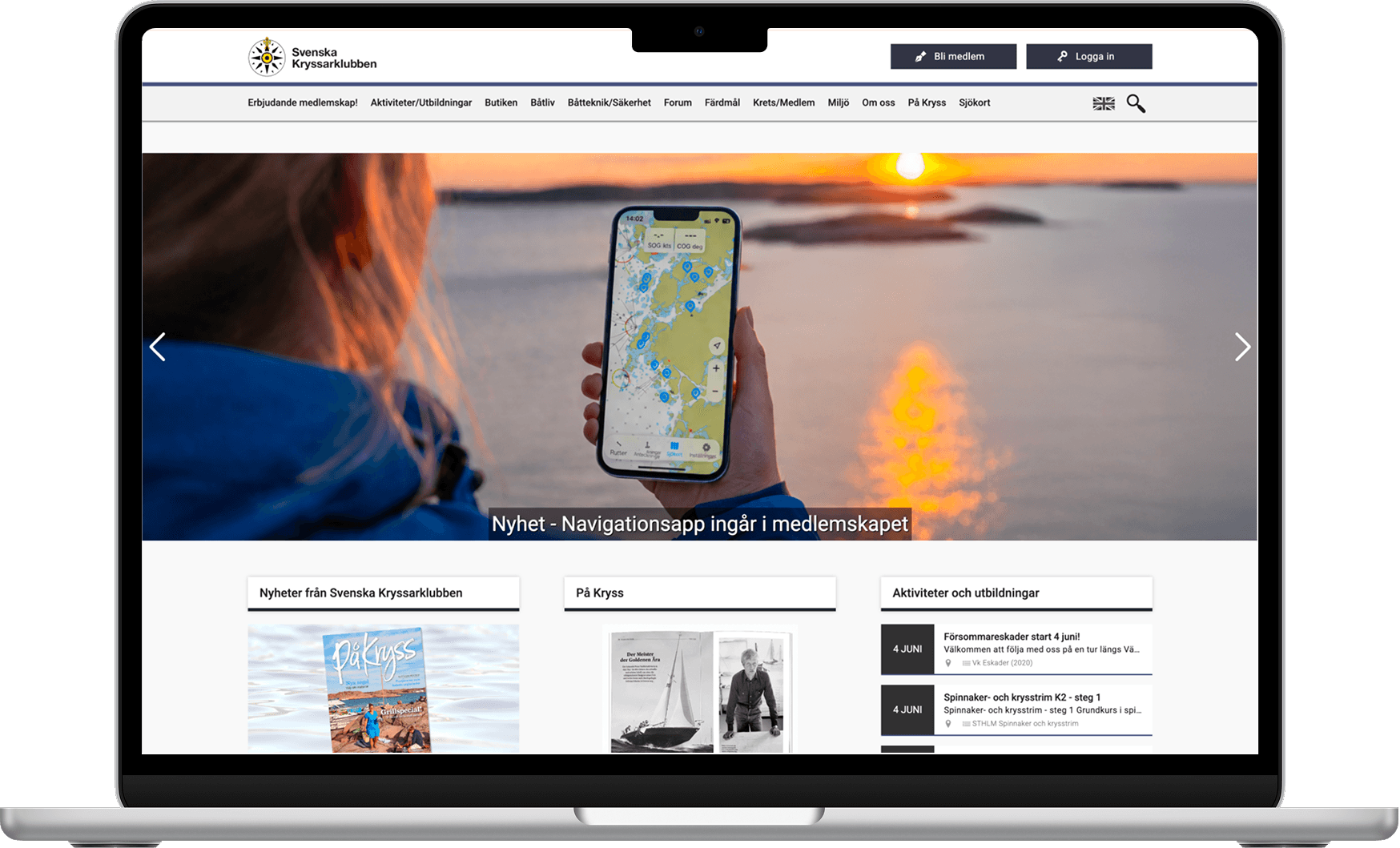
SXK's website was built in 2013 and optimized for experienced sailors, not for curious newcomers who have never owned a boat. Their membership is aging fast, and the digital experience wasn't helping attract a younger audience.
Understand how a first-time visitor aged 20-30 currently experiences the SXK website. Identify where the journey breaks down, where the value proposition fails to land, and where small, targeted design changes could meaningfully improve conversion from visitor to interested prospective member.
User Persona
The Lapsed Interest User
20-30 years old. Has touched sailing before through family or friends. Has had one or a few experiences, but has never committed. Arrives to the Svenska Kryssarklubben website with some intent but leaves without acting. The barrier is usually cost, commitment level, or not knowing how to get started again.

“I sailed with my dad as a kid. I still think about it sometimes. I just never really found my way back in.”
Our Approach
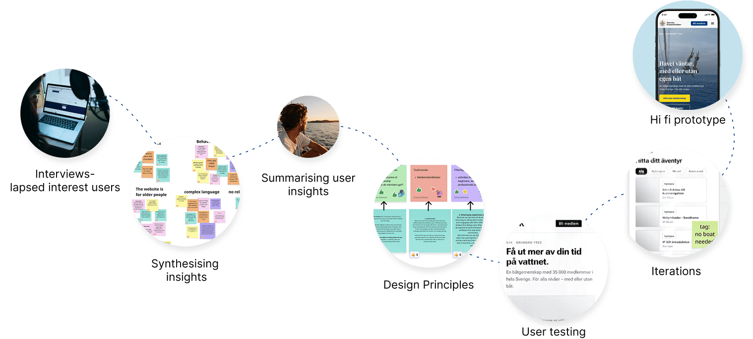
User Insights
Users can't understand what SXK offers them All 5 participants gave vague, different answers to "what is SXK?" even after viewing the homepage. The site lists institutional features (klubbtidning, kurser, försäkring) rather than concrete personal outcomes.
No visible entry point for beginners Navigation assumes an active boat owner. There is no recognisable doorway for someone without a boat. Participants looked for a "start here" path and couldn't find one.
The site signals it's not for them All 5 participants said unprompted that the site felt aimed at older people. The barrier was not sailing itself, it was how SXK was presenting itself.
Hypothesis
“We observed that lapsed interest 20–30-year-olds cannot understand what SXK membership is or what it offers after landing on the homepage, because the page is complex and unclear rather than answering 'what do I get and is it worth it?' This suggests an opportunity to make the value of SXK membership immediately clear to a first-time visitor - which we would measure by an increase in the share of users who can correctly describe what members get after a 30-second exposure.”
User testing with Lo-Fi Figma Prototype
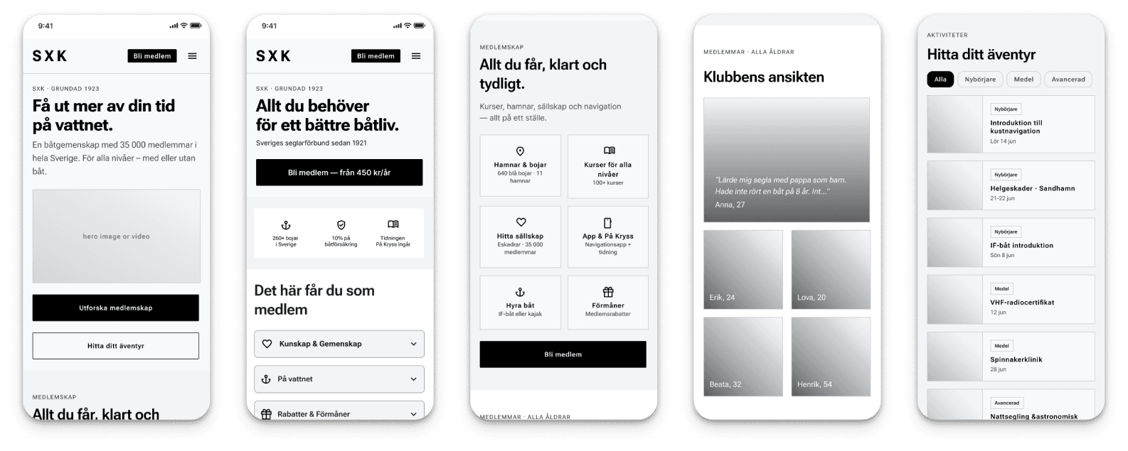
See the full prototype
What worked well
All four described the prototype as a major improvement over the original site. P. said "It's an amazing improvement", F. said the membership section was "much more straightforward", and I. said "just one scroll and I feel like I can see everything."
Specifically:
Membership benefits were now comprehensible — participants could name concrete things they'd get (courses, harbours, community, boat access)
Navigation felt clean and easy across the board
The member stories section landed well — I. especially loved seeing ages and women represented
The activity filter by experience level got the strongest single reaction: I. said "Capital L Love"
What still needed work
"Med eller utan båt" wasn't prominent enough — E., F., and P. still read the prototype as primarily for boat owners. P. said: "I see it says 'all levels, with or without boat' — but I didn't read that first. The overall impression is still a boat community."
The main CTA felt too committal — none felt ready to click "Bli medlem". I. was most specific: "Is there a newsletter, an interest email, someone I can talk to? I'm not ready to become a member right away."
"Hitta ditt äventyr" was unclear — P. had no idea what it would lead to and wouldn't click it
Testimonials lacked context — E. wanted to know where the people were located; F. and P. suggested short video interviews would be more effective
"På kryss" remained unclear to P.
Design improvements
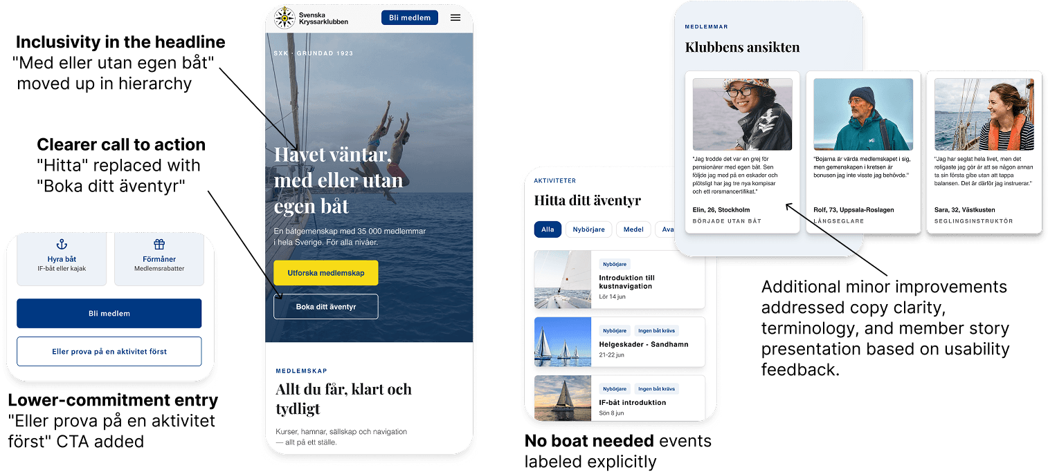
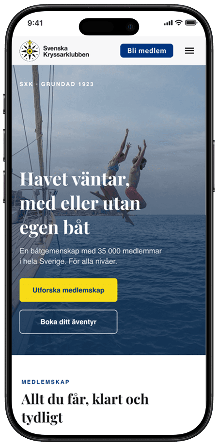
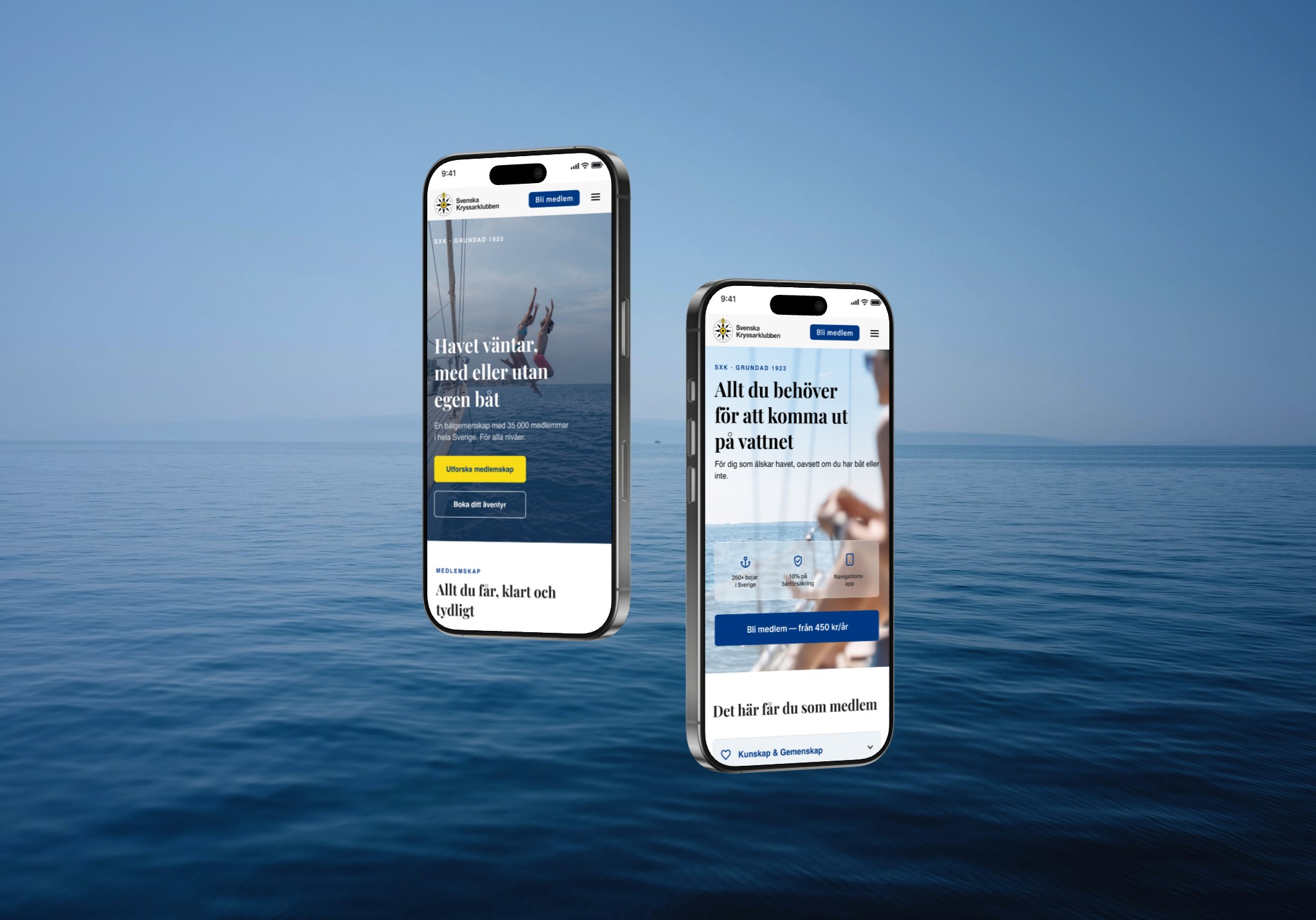
Final Hi-Fi Prototype
Every design decision in this prototype traces back to a finding. The headline now leads with "with or without a boat." Non-owners see a clear first step before they hit the membership page. The experience filter lets visitors self-select their starting point. Testimonials feel like real people, not a brochure.